Designing for digital accessibility:
from logo to website
Client -> Carmen Burghardt, Esteem Services -> Branding, Digital Design, Illustration

About the project
Esteem is a young agency specialised in digital accessibility. Founded by accessibility specialist Carmen Burghardt, Esteem aims to make digital accessibility clear and doable. In 2025 I teamed up with Carmen to give Esteem a brand identity and design a landing page.


Accessible by design
When you're all about digital accessibility, your brand needs to reflect that. Practise what you preach, right? So every design decision had a reason, here’s how we made that work.
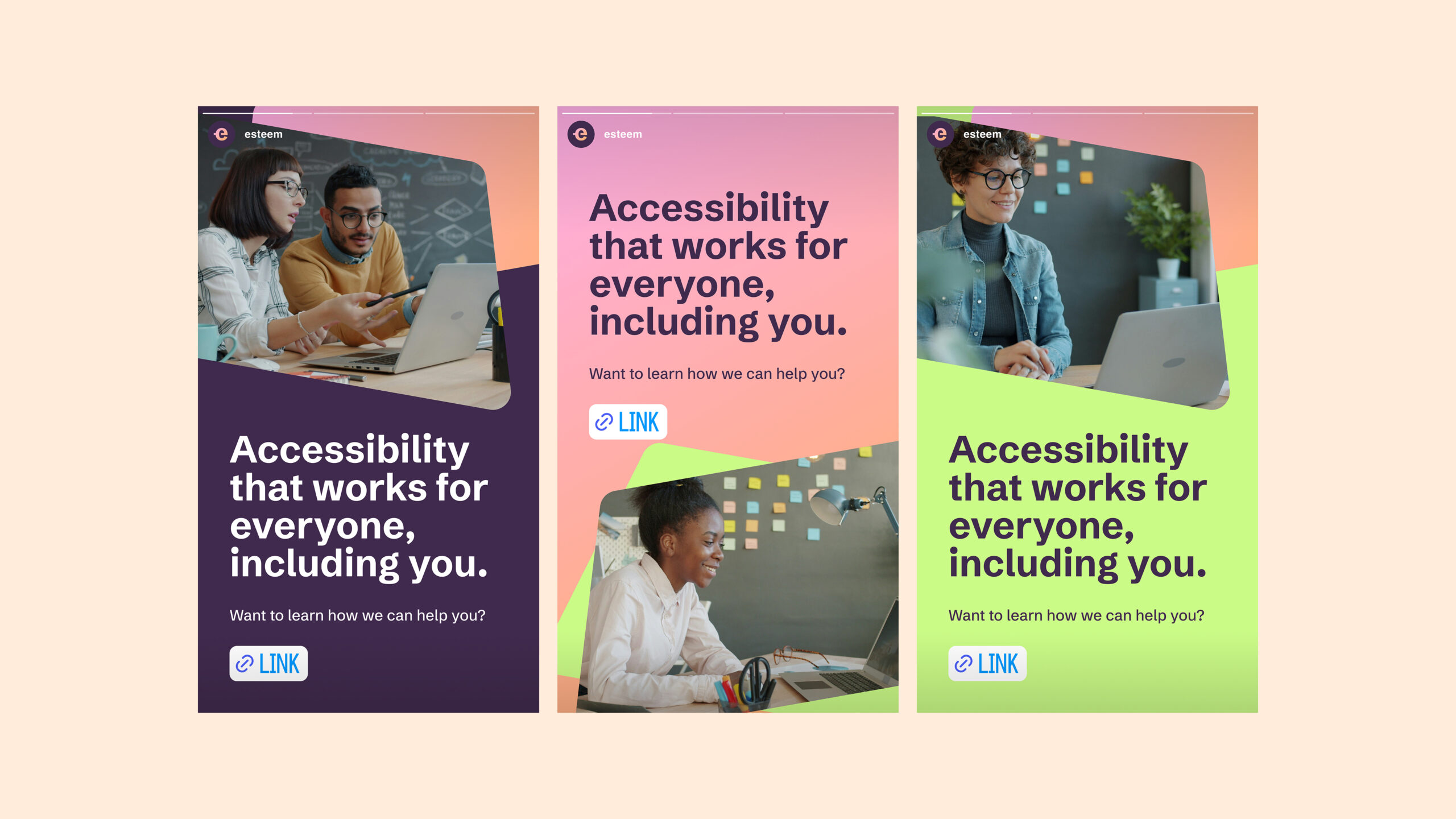
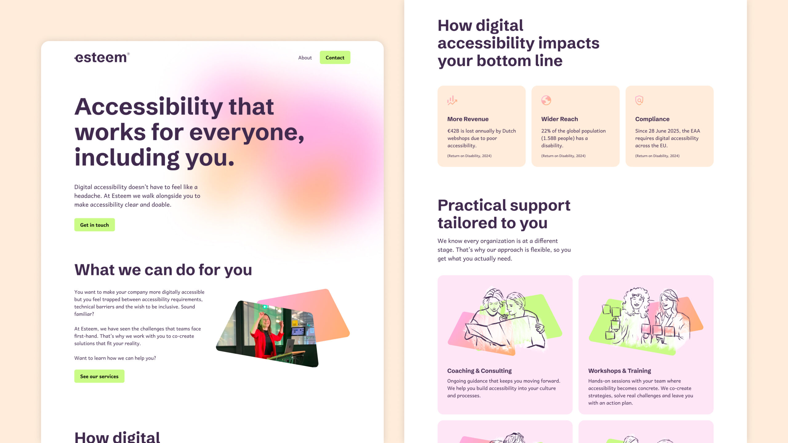
The color palette is fresh and bright, and built around WCAG color contrast standards. Carmen wanted the brand to feel feminine, so we opted for soft pink and orange as main colors. A dark purple provides great legibility, and a neon green as an action color keeps the palette from feeling too soft.
The type combines a legible display font with a typeface specifically developed with accessibility in mind. The result is a bold, playful combination that's easy to read for everyone.


The logo
For the logo we wanted something professional and clean, without being boring or too corporate. The wordmark is open and transparent, has a forward movement, and feels playful. There's a tiny accessibility mark in the upper right corner, almost hidden like a copyright symbol, as a quiet reminder that accessibility is always present in Esteem's work. Carmen tested the logo with an AI screen reader tool, and it read it perfectly.
Visual style
For the visual style we played with soft pastel gradients and shapes with rounded corners. The name "Esteem" comes from the fourth layer of Maslow's ‘Hierarchy of Needs’, so we took that shape and made it a recurring visual element throughout the brand. Next to that, I made a set of four illustrations representing Esteem's services: coaching & consulting, workshops & training, quick scans, and accessibility audits.


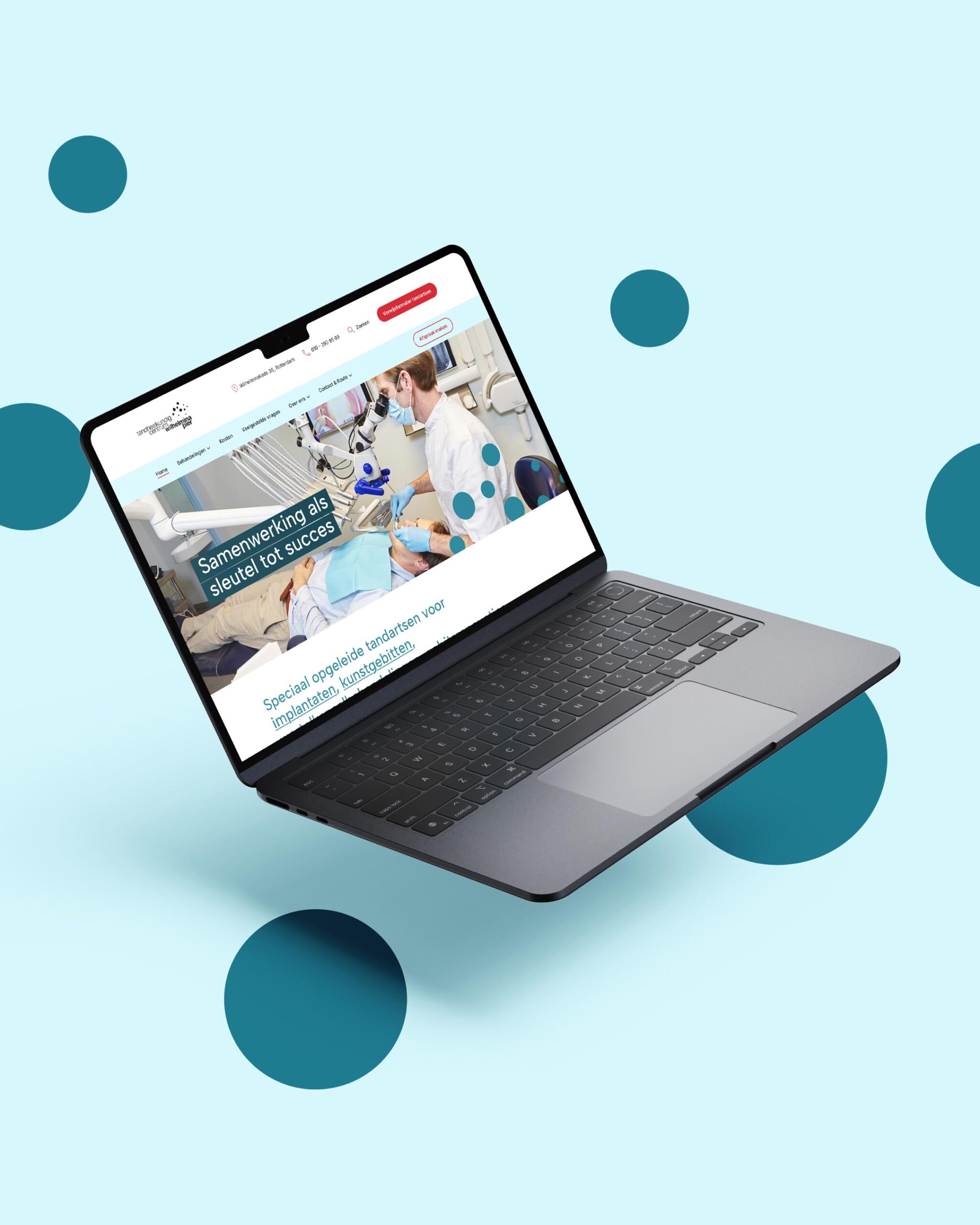
Website
Carmen and her team developed a prototype of the landing page, which I then designed using the new visual identity. Together we made sure the website is fully accessible without losing the playful, friendly character of the brand.
Kind words
"Jantine is one of the most professional people I’ve worked with. She’s warm and a joy to collaborate with. Her guidance throughout the process was thorough, and she delivered high-quality work. I’m truly happy with my brand—it feels like an authentic reflection of what I wanted, while also communicating it clearly. She did her research and felt heard in my feedback. She’s patient and adapts naturally to her client’s flow. She’s also honest and clear about what will and won’t work. On top of that, her knowledge of inclusive visual design is excellent. I’d recommend her to anyone looking to work with her."
Carmen Burghardt
Digital Accessibility Coach at Esteem
Want to see the website in action?
Visit website ->
More work


Let’s get in touch!
Haelsum is a Rotterdam-based design studio offering branding, web design, digital design, and illustration for creative and mission-driven brands. Working with clients in the Netherlands and worldwide.
© 2025 Haelsum — Thoughtful design made with care, coffee, and a little bit of creative magic.
LinkedIn — Instagram — Terms & Conditions: Dutch — English — Cookie Policy