Rebranding Behapp, a research instrument to help map mental health disorders

About the project
Behapp is an app and research instrument used in medical scientific research contexts. By mapping social behavior the team is looking for the relationship between that behavior and mental health disorders, specifically depression, schizophrenia and dementia. Together with Behapp & Q42 I worked on a new brand identity and set of animated illustrations.


Brand Identity
For the visual identity we merged the professional, serious side of Behapp with their young and innovative side: merging healthcare with tech. The logo icon is shaped like a clock, symbolizing how Behapp maps their users throughout their days. The clock is combined with a graph, referring to the insightful visualized data the app provides.
The color palette and typographic approach are a combination of the professional and innovative characteristics of Behapp as well. We picked a blue color referring to healthcare and research, yet made it bright to give it a modern, fresh appeal in combination with the bright yellow.

Kind words
“We highly appreciate working with Jantine! She is a great communicator and very structured in her approach towards her work, while also leaving plenty of room for creative playfulness in any designs and iterative proposals. For us this has resulted in an amazing brand package to help showcase our scientific research and further our work. We look forward to continue working with Jantine and trust her to steer us in the right direction.”
Raj Jagesar
Information Science at University of Groningen & Behapp


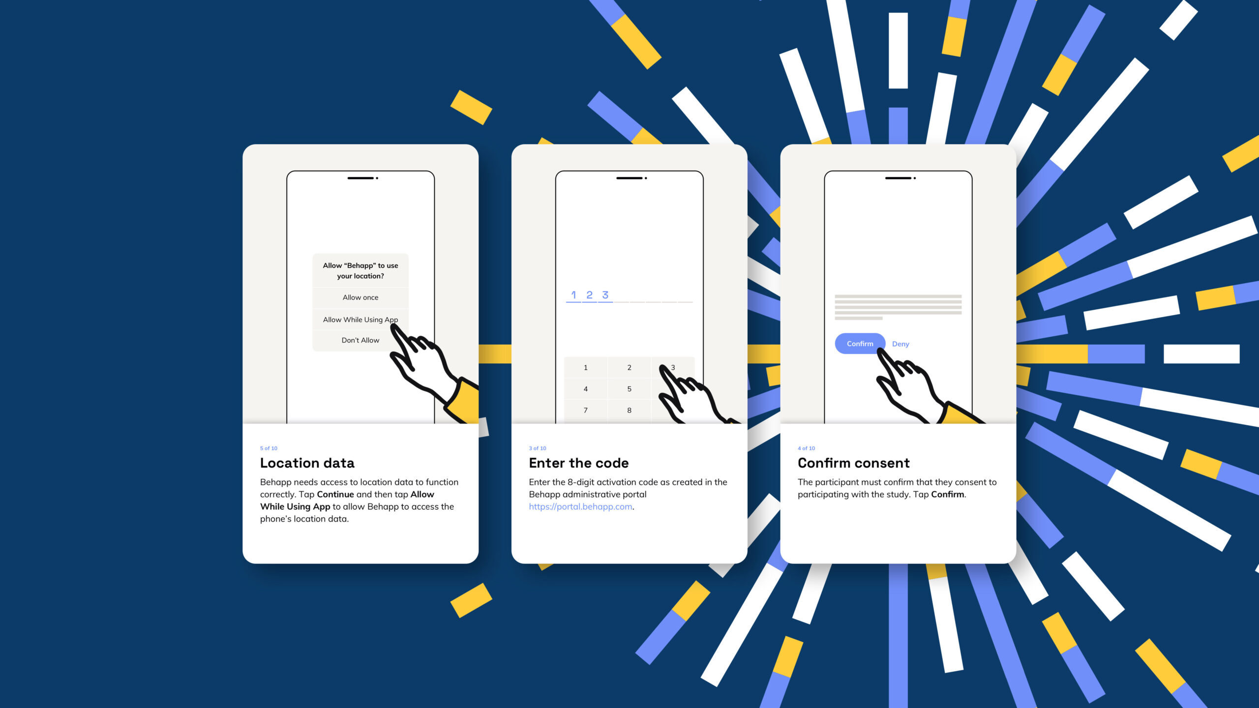
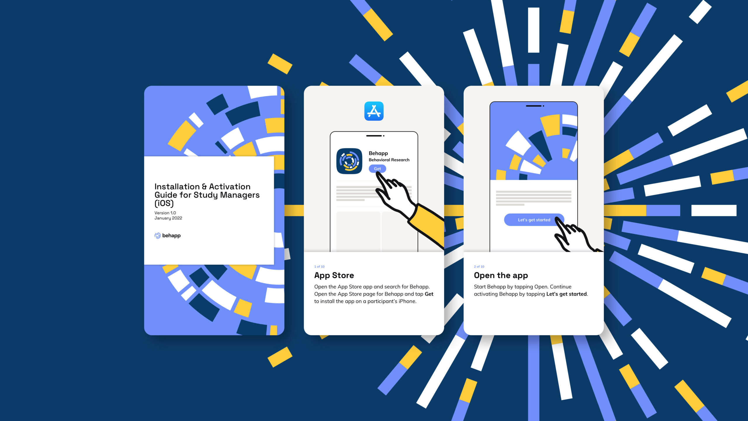

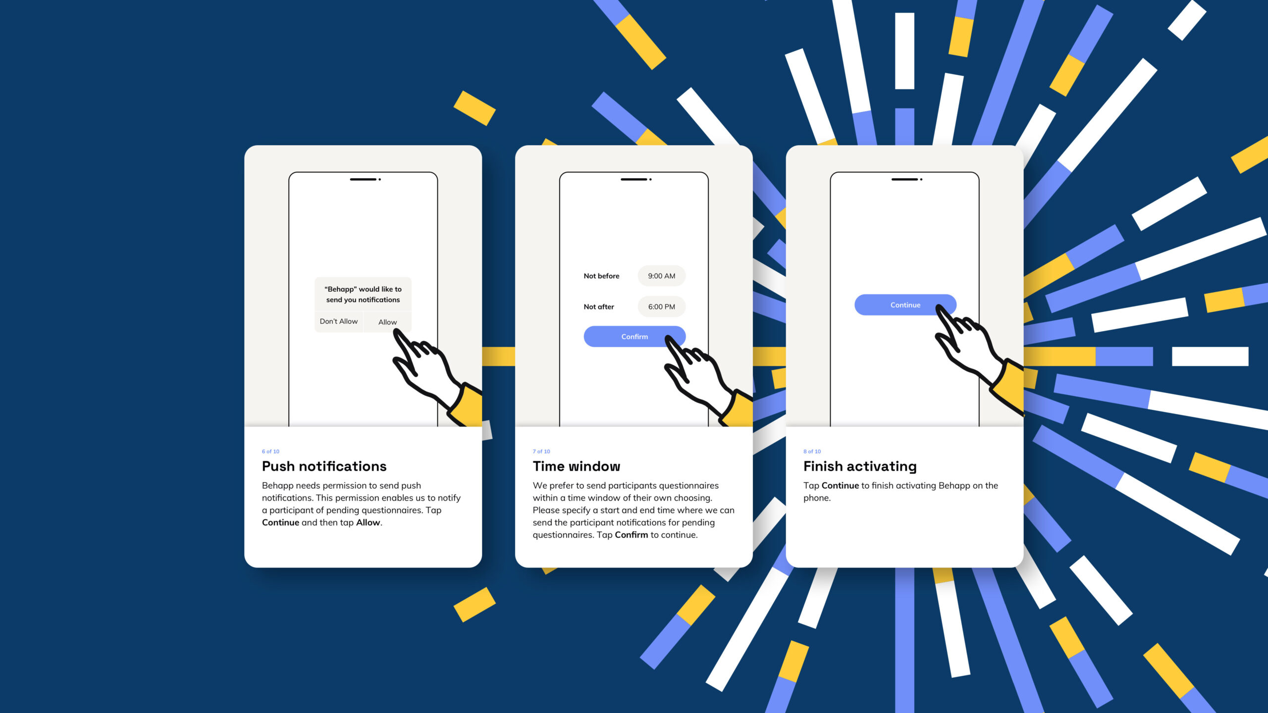
Illustrations
The visual identity is enriched by illustrations. The first set is based on data visualization, and can be seen as an illustrated, larger version of the logo. The illustrations can be used in all the brand’s colors as a decorative element.
Next to the data visualizations we worked on a set of animated illustrations showing the daily life of people using Behapp. We see people in daily activities Behapp can monitor: during sleep, exercise, commuting, socializing, while working and while feeling isolated. Behapp is shown in the illustrations as a dog: accompanying the people in their activity yet never taking the lead – just like the app does.
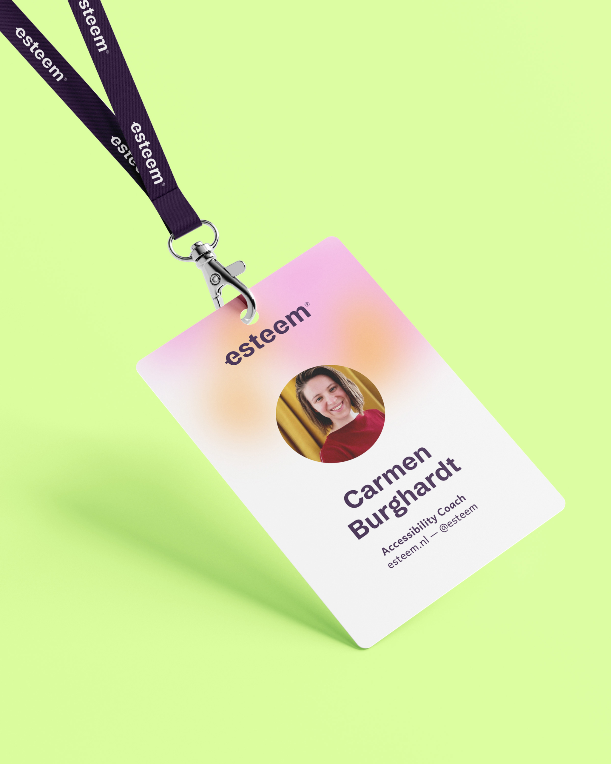
Last but not least we worked on a set of team portraits.


More work


Let’s get in touch!
Haelsum is a Rotterdam-based design studio offering branding, web design, digital design, and illustration for creative and mission-driven brands. Working with clients in the Netherlands and worldwide.
© 2025 Haelsum — Thoughtful design made with care, coffee, and a little bit of creative magic.
LinkedIn — Instagram — Terms & Conditions: Dutch — English — Cookie Policy