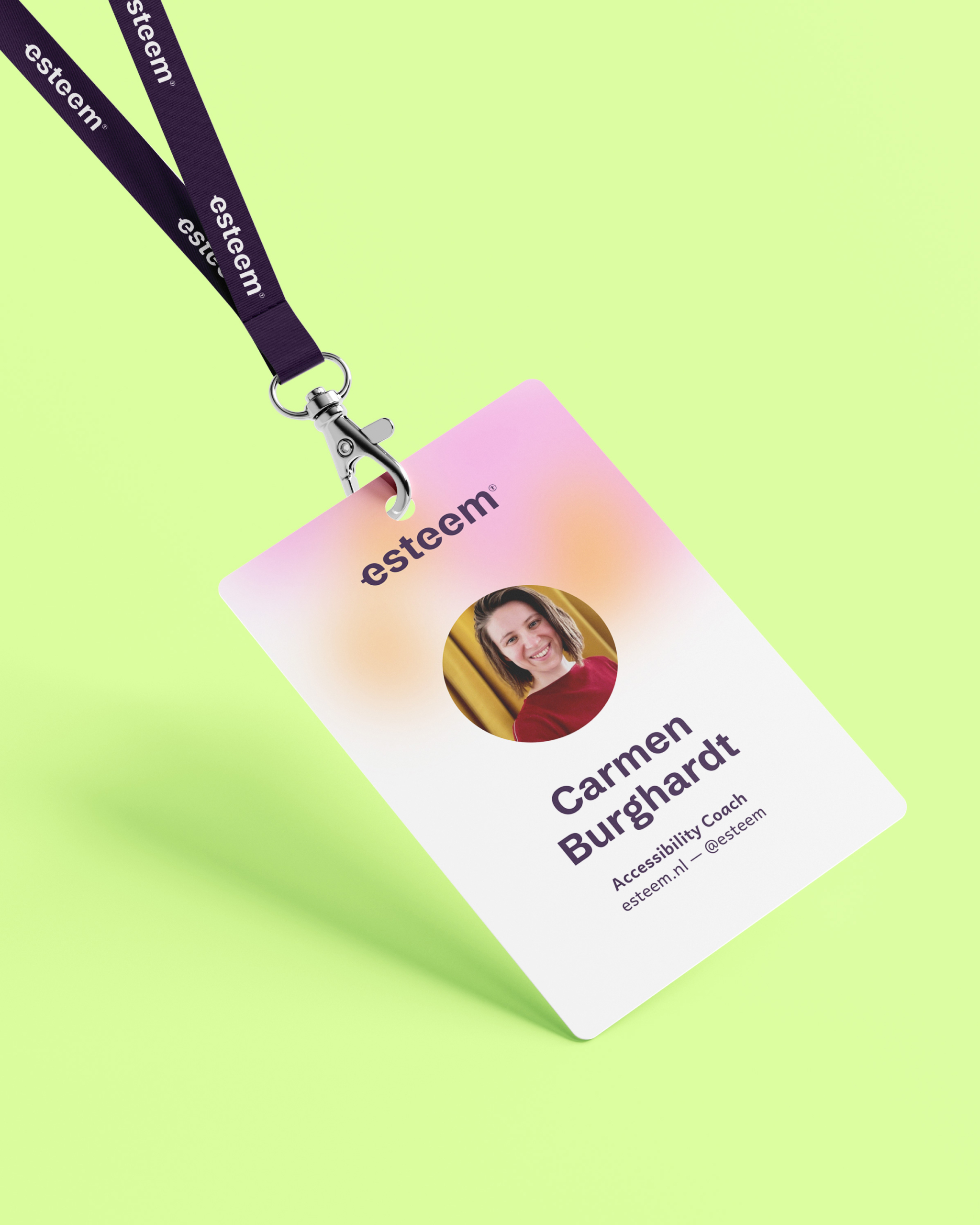
A modern, transparent brand identity for online service platform Flexparency
Client -> Flexparency Services -> Branding, Digital Design Team -> Additional webdesign & website build by Niki van der Ende, Witty Bits

About the project
Flexparency is an online service platform that matches professionals to new jobs and projects. Where other platforms often focus on the companies providing the projects, Flexparency focusses on the professionals. Finding the right match for you in over 160.000 unique opportunities every year can be quite a challenge – one Flexparency simplifies by using the professional’s skills and preferences as a filter. To launch the brand in 2022 we worked on a brand-new brand identity that would appeal to Flexparency’s professionals and fit into the variety of branches they’re operating in.


The logo
For the logo we wanted a modern approach: a wordmark with an integrated icon which can also be used on its own. The icon symbolizes how Flexparency unites supply and demand on their platform, and how they will always put the professional’s wishes first.


Color & Typography
The brand’s color palette has a variety of greens – symbolizing energy, positivity and growth – and modern gradients that match the open, human approach of the platform. The typography is a mix of a clean, accessible font that delivers a positive user experience on the platform, and a fresh, modern font that gives the brand character.


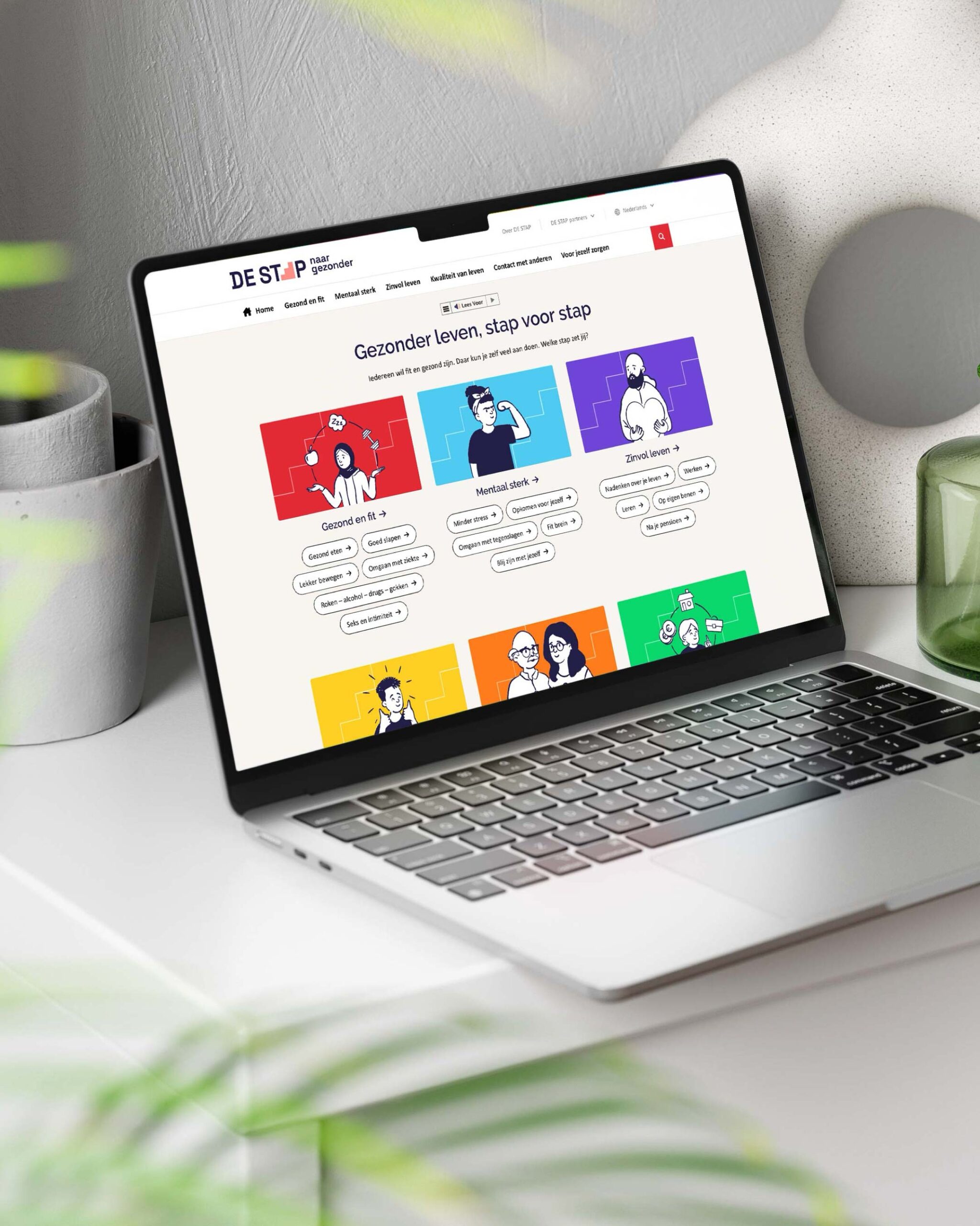
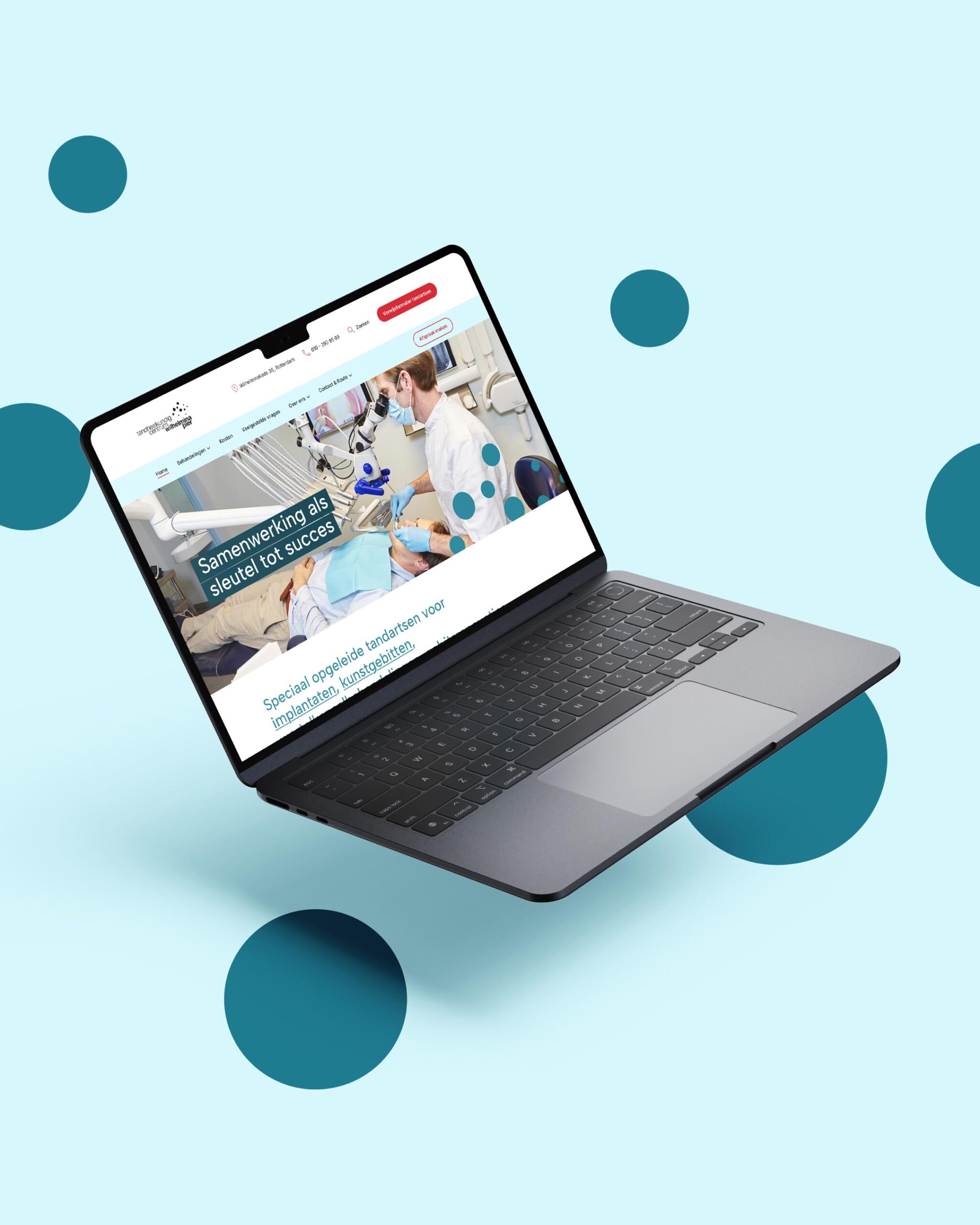
The website
The digital appearance of the Flexparency brand has played a key role during the design process. We opted to integrate the design of the website into the branding project, testing the look & feel of the brand in an online environment. The structure of the website is based on the same brand values of the brand identity: clean, transparent and human.

Want to see the website in action?
Visit website ->
More work


Let’s get in touch!
Haelsum is a Rotterdam-based design studio offering branding, web design, digital design, and illustration for creative and mission-driven brands. Working with clients in the Netherlands and worldwide.
© 2025 Haelsum — Thoughtful design made with care, coffee, and a little bit of creative magic.
LinkedIn — Instagram — Terms & Conditions: Dutch — English — Cookie Policy